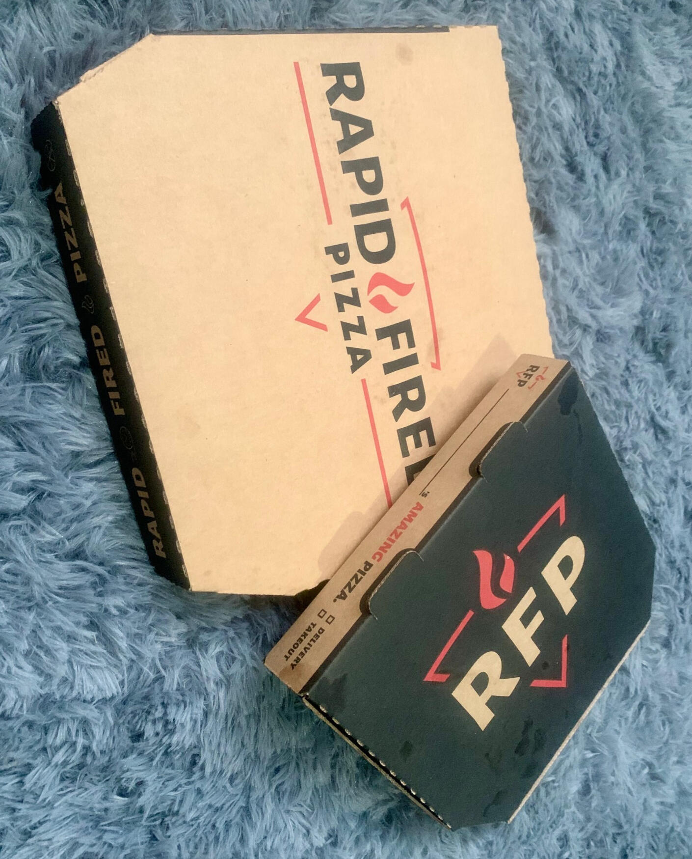
🍕 Packaging, Engineering, and Designing Project
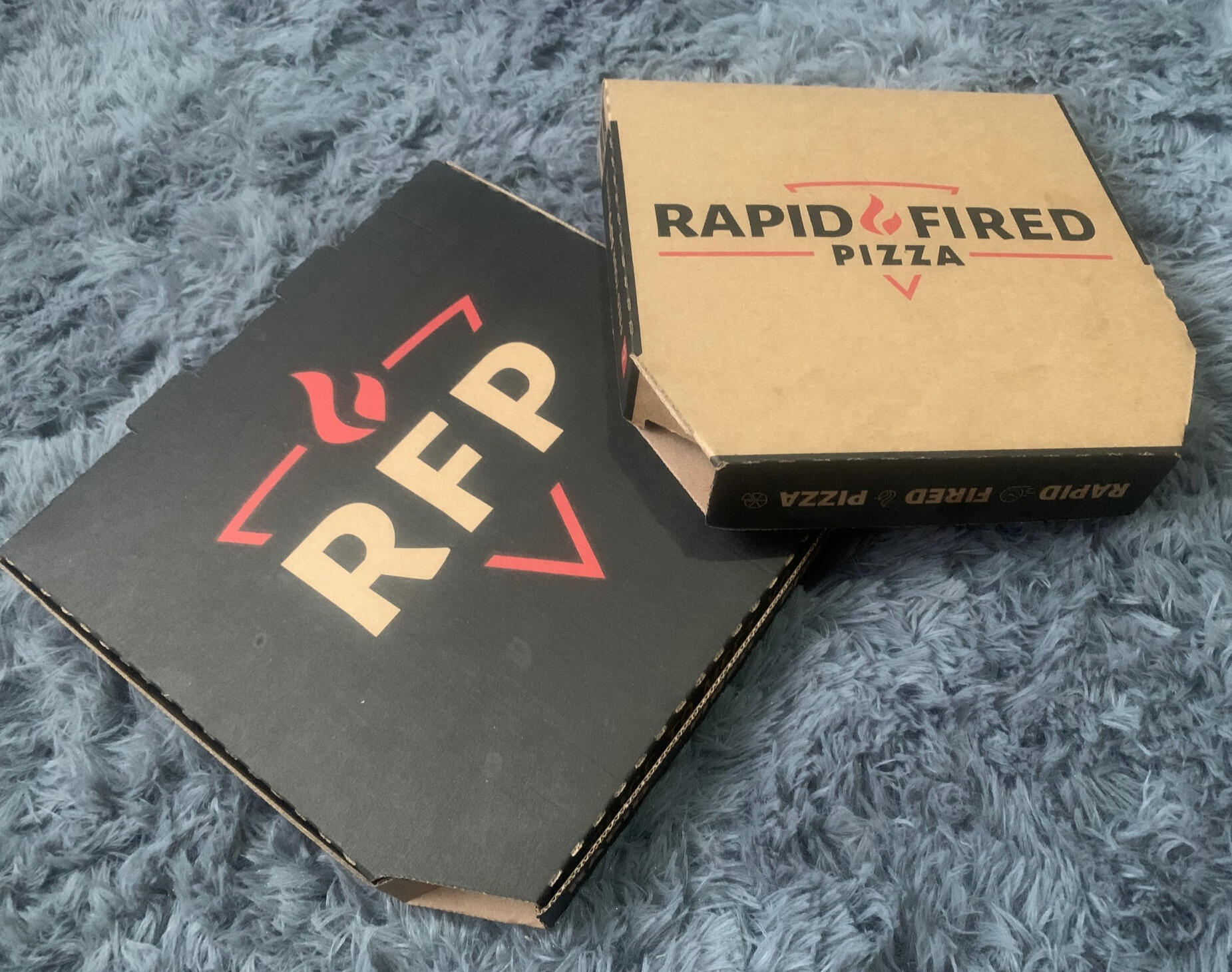
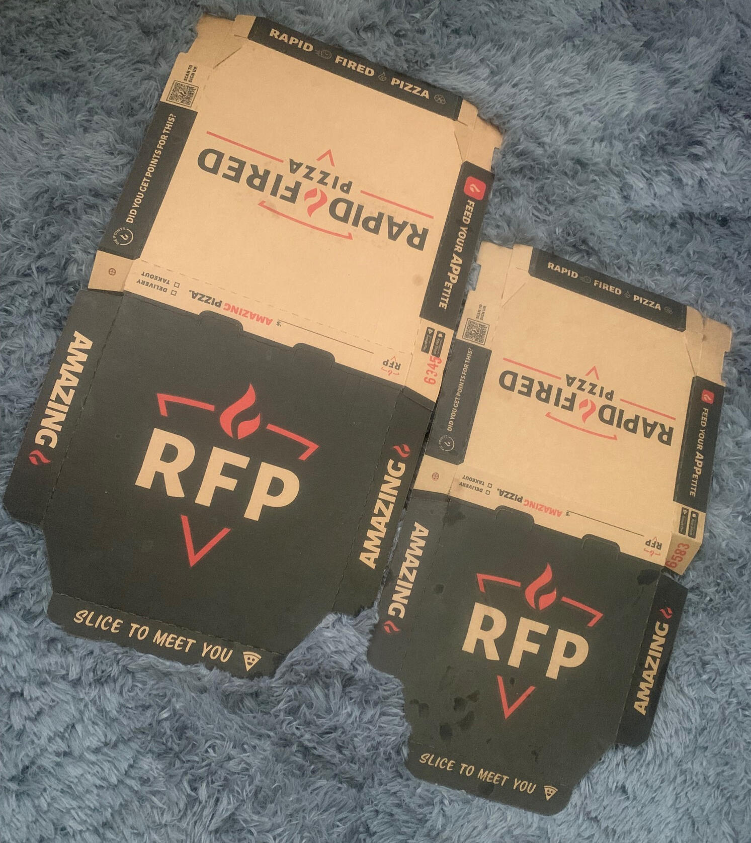
At NMP, most packaging projects started with standard templates—but the Rapid Fired Pizza box was different. This one was built entirely from scratch. I CAD-engineered the structure, using a Domino’s box only as a reference point, then customized the design to meet Rapid Fired Pizza's brand, production requirements, and cost targets.This design included flood printing, optimized structural layout, and a balanced sheet arrangement that allowed 3–5 outputs per master form. Every decision had a purpose. Every fraction of an inch mattered.Working in AutoCAD and Adobe Illustrator, I managed:Clean 1/8" bleedsPrecise trapsVector artwork scaled for 9", 11", and 14" box sizesEfficient cut-out optimization to reduce material wasteAlignment that held up during print productionThe project demanded patience, precision, and constant problem-solving—exactly the kind of challenge I thrive on. It became one of my favorite builds, not only because Rapid Fired Pizza had a store nearby, but because it proved how much innovation can come from constraints. High-volume orders bring high stakes—but also the most rewarding results when everything lines up perfectly.
After more than seven years in packaging design, I’ve learned that a portfolio tells the truth more clearly than any résumé. Every box, every die line, and every proof is part of the journey. This one remains a highlight—where creativity met engineering and delivered results that worked on press, on the shelf, and in the customer’s hands.🧭 Ready for What’s NextI’m now actively seeking remote creative opportunities as a:Packaging DesignerGraphic DesignerQuality Assurance Specialist👉 Follow along—I’ve created more portfolio articles in this series.
🪆 Sizing for a significant slice of pizza and fried chicken
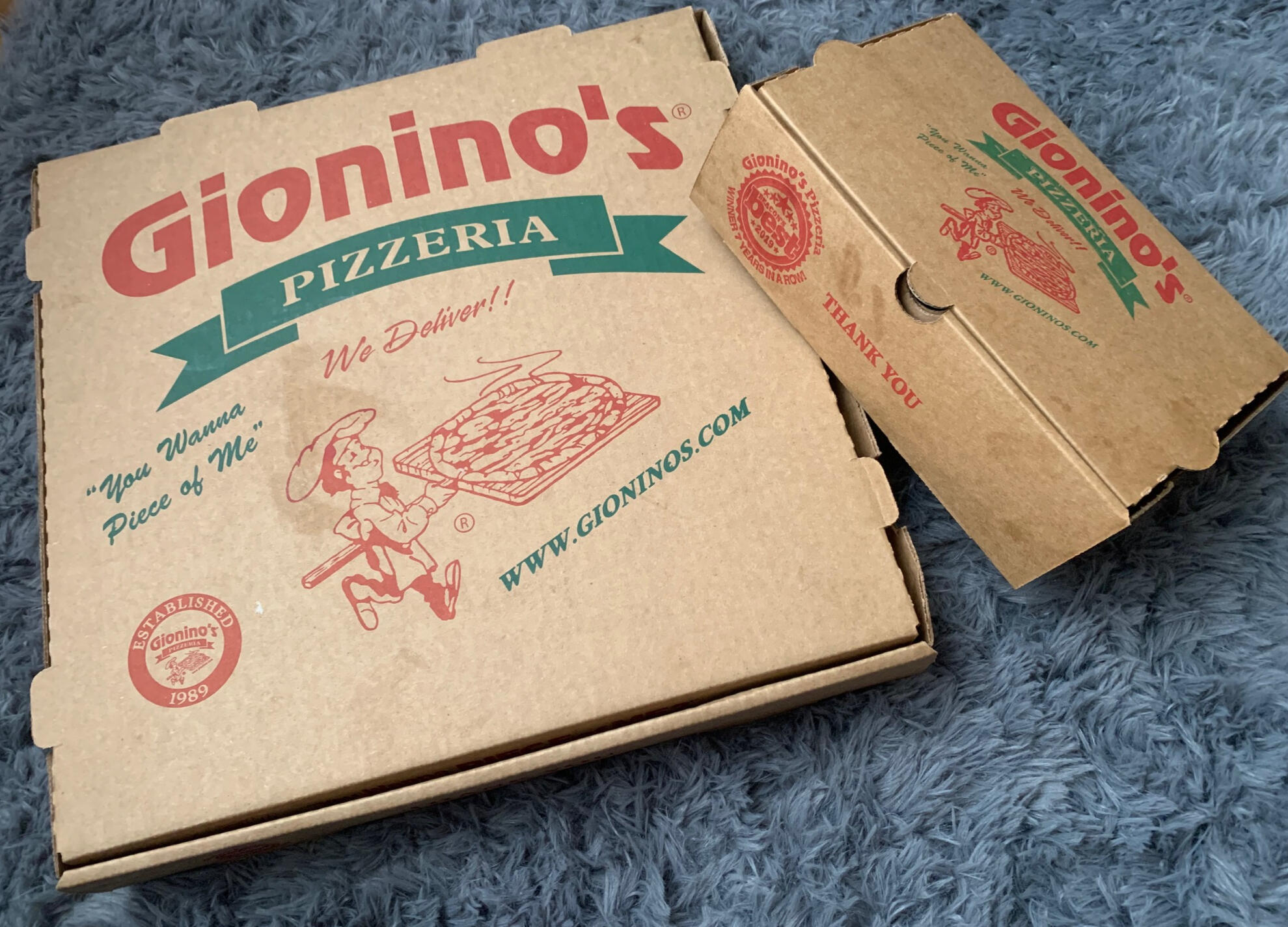
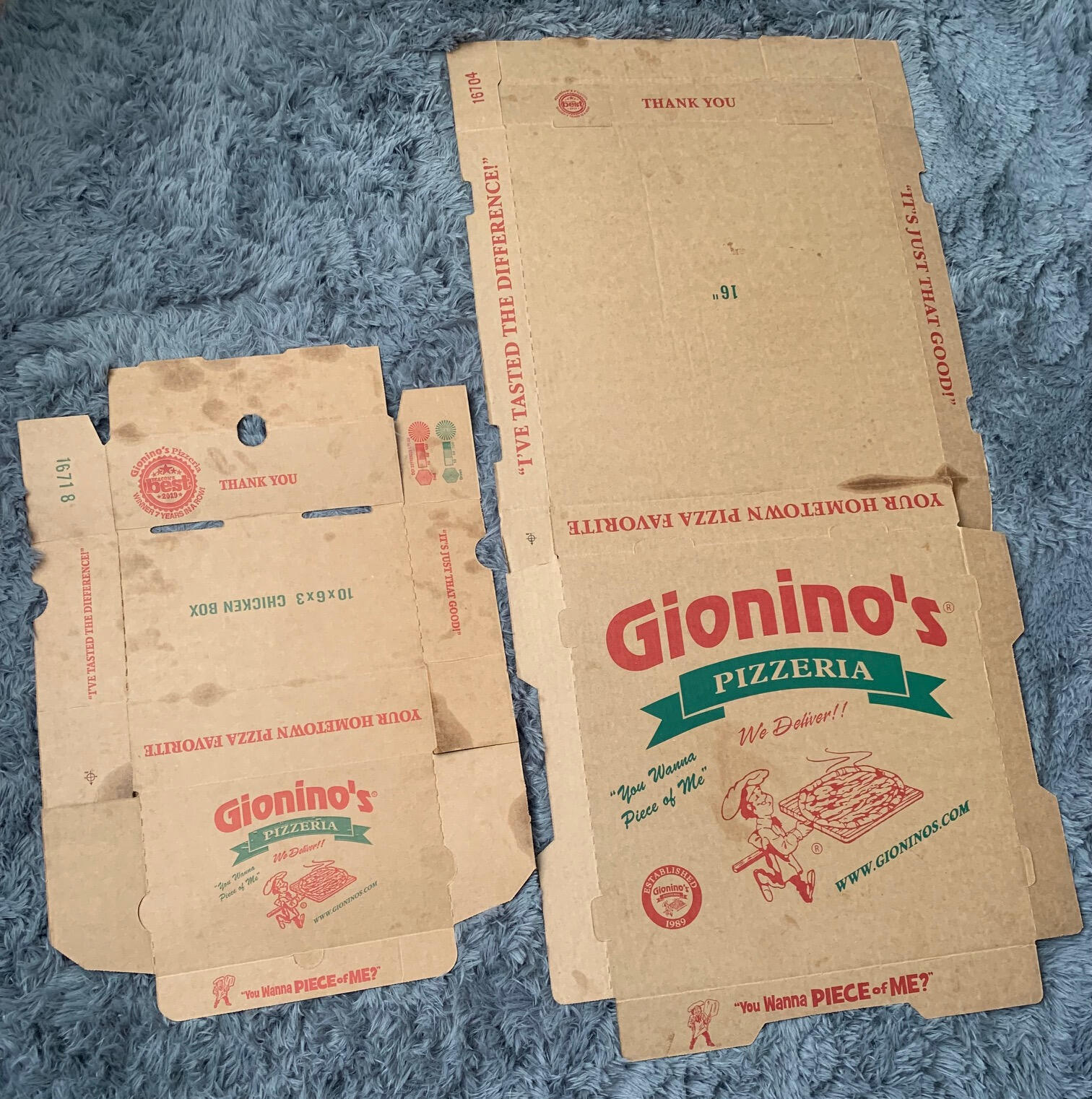
In packaging design, even the tiniest miscalculation can create significant problems. That’s exactly what happened on my first project for Hillcrest. The 12" and 16" pizza boxes weren’t fitting properly—the way the pizzas were made and packaged created unexpected tension. Even minor misalignment could affect how boxes are folded, retained heat, and ultimately, the customer experience.At first, it felt like a setback. But I saw it as an opportunity to refine both the structural layout and design workflow—and even propose a potential sub-box concept to expand the product line. While Hillcrest didn’t have additional projects at the time, the lessons I learned became a cornerstone of my packaging approach.⚙️ Technical Approach: Start Small, Scale SmartEverything starts with structure. Before touching visuals in Adobe Illustrator, I relied on my AutoCAD skills to create precise die lines for each box size. This ensured structural integrity and that folds, bleeds, and alignments would hold up in real-world production.Once the structure was solid, I transitioned to vector-based graphics in Illustrator, keeping designs scalable across 9", 12", and 16" boxes while maintaining sharp details and brand consistency. By combining engineering precision with creative design, I developed a workflow that prioritizes technical accuracy first and creative elements second—a process I still follow today.📌 Lessons LearnedVector Art = Versatility: Logos, patterns, and visuals stayed sharp across multiple sizes.Speed Requires Structure: Accurate CAD layouts and vector files streamlined production and reduced errors.Design Follows Function: Packaging communicates brand quality and product care, not just aesthetics.This project became a favorite because it married engineering precision with visual storytelling, proving that attention to detail at the structural level enhances efficiency and brand impact.🔍 ReflectionHillcrest taught me that great packaging design is about balance—between problem-solving and creativity, structure and expression, function and brand identity. Every box tells a story—not just of the product inside, but of the strategy, care, and thought invested in the process.🧭 Ready for What’s NextI’m now actively seeking remote creative opportunities as a:Packaging DesignerGraphic DesignerQuality Assurance Specialist👉 Follow along—I’ve created more portfolio articles in this series.
💡 From Bag to Box: Rethinking What Good Packaging Could Be
For seven years, my title at NMP was Art and Design—but my role went far beyond visuals. Titles never mattered as much as solving problems, bridging design and production, and delivering results. I didn’t just create graphics; I engineered ideas, tested materials, and optimized processes to achieve practical, scalable outcomes.One area that consistently caught my eye was sub boxes—small, rectangular corrugated boxes ideal for sandwiches, wraps, or catering. Despite their potential, very few were produced.While reviewing the project database one afternoon, I noticed over 18 accounts could have benefited from sub-box designs—businesses with “sub” in their names—but only three designs had ever been realized.🧩 The Challenge: Missed OpportunitiesWhy so few? Likely cost. Bag wrappers are cheaper than corrugated boxes, especially for 2- to 4-color prints. While I understood the business rationale, I kept asking: What if we approached this differently?At NMP, I focused on optimization—reducing material waste, adjusting bleeds, and consolidating artwork across sizes. Even a few cents saved per unit mattered at scale. Minor tweaks in structural layout or print production could often justify switching from a bag to a box.Presto Foods became one of the few clients to invest in sub-box packaging. Their design married durability, clean branding, and structural balance. The result wasn’t flashy, but it was efficient, stackable, and print-friendly—a true example of function meeting form.📏 Approach: Structure, Consistency, EfficiencyMy process relied on three key anchors:CAD First – Define die lines, folds, and dimensions with precision.Vector Next – Apply graphics in Illustrator for consistency across sizes and variations.Print Balance – Optimize layouts for efficiency on master sheets, minimizing waste and production issues.This workflow ensured boxes looked polished while working seamlessly in production—bridging the gap between design vision and practical execution.🚀 ReflectionThe sub-box projects taught me that not every idea finds its moment—but every idea leaves a lesson. Innovation in packaging isn’t always about doing more; sometimes it’s about spotting potential in the overlooked.If given the chance to revisit sub boxes today, I’d explore modular designs adaptable for small and large vendors—lightweight, eco-conscious, and visually strong. This “what if” chapter continues to shape my perspective: balancing creativity, functionality, and efficiency in every design decision.🧭 Ready for What’s NextI’m actively seeking remote creative opportunities as a:Packaging DesignerGraphic DesignerQuality Assurance Specialist👉 Follow along—I’ve created more portfolio articles in this series.
🏎️ Student to Freelancer: The Spring That Sparked Hope
Sometimes the smallest moments spark the biggest opportunities.
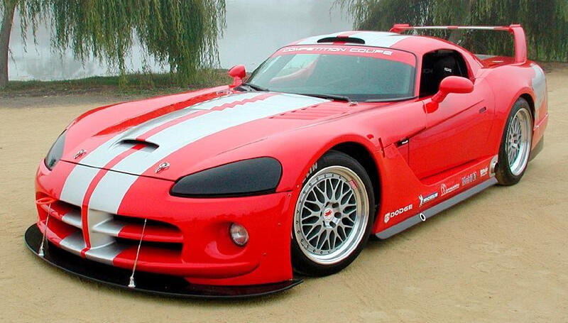
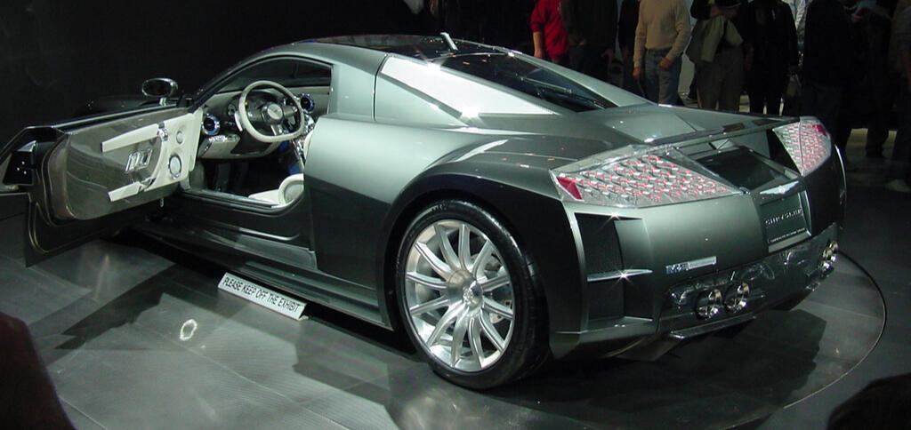
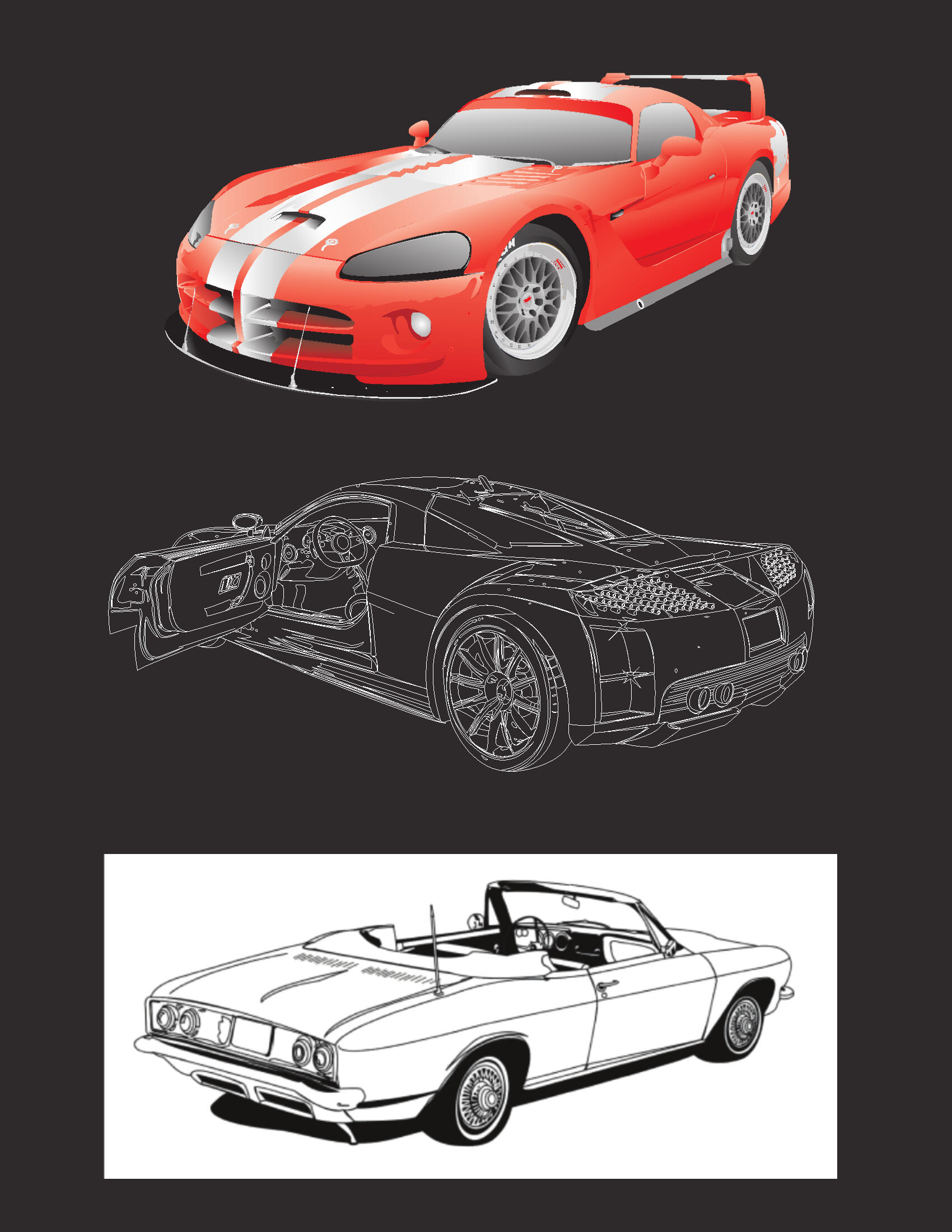
For me, it started with cars—not because I was a car enthusiast (that was my younger brother, Kevin), but because cars gave me shapes to study. My first serious drawing was a Dodge Viper: bold lines, sharp edges, and hours spent perfecting every curve. Art became my lane.In 2005, while printing my business cards, I added an illustration of the Chrysler ME Four-Twelve to the backside—clean linework, sharp perspective, and the kind of detail I loved building in Adobe Illustrator. A printer noticed and asked:
"Would you be interested in doing a project for me?"That question became my first freelance job: a crisp, production-ready line illustration that could be customized in any color. It taught me my first lessons in graphic design, proofing, and preparing artwork that holds up in print production.Weeks later, I graduated—one of only 50 out of 200+ students. That project felt like confirmation: This is real. I can do this.The years that followed were anything but linear. I pursued my bachelor’s degree, navigated jobs and workplace challenges, and rebuilt my confidence multiple times. Each step—good or difficult—added resilience, skill, and clarity.I learned two important things:Sometimes opportunity announces itself quietly—like an illustration on the back of a business card.And sometimes, walking away from the wrong role creates space for the right one.🧭 Ready for What’s NextI’m now actively seeking remote creative opportunities as a:Packaging DesignerGraphic DesignerQuality Assurance Specialist👉 Follow along—I’ve shared more portfolio articles in this series.
🖊️ The Story Behind My Logo: Fusing Creativity, Precision, and Purpose
Every designer has a story behind their logo. Mine began in 2002, when I joined a selective Commercial Arts program at a Joint Vocational School (JVS). Only eight students were accepted from multiple schools, and our final assignment was to create a personal logo that reflected our identity as artists and professionals.After sketching several concepts, I took a classmate’s advice: use my initials as the foundation. The logo had to be one color—bold, balanced, and unified. Working in Adobe Illustrator, I experimented with arrangements until an unexpected discovery: I integrated my middle initial, “L,” between the “E” and “B.” The result was a clean, cohesive mark that balanced creativity with precision.
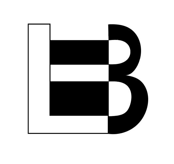
The first draft was simple: a one-color “B” with sharp, minimal lines. Nothing flashy—but it felt right. It was personal. It was mine. (You can see the original rough below.)
That small discovery taught me the essence of graphic design: simplicity, proportion, and adaptability can transform a personal idea into a professional identity.🔎 Hidden Layers and Design Thinking
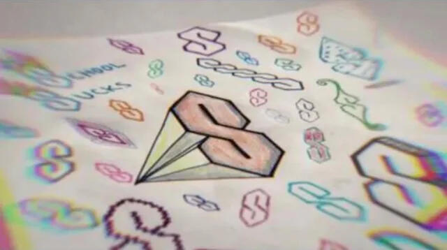
I refined the structure over time—shortening the “L” and reshaping the “B” to create symmetry and flow. I’ve always loved clever visuals that reward a second look, and my logo reflects that philosophy. It’s not just letters—it’s a study in how form and function intersect.Inspired by drafting and architectural design, I incorporated subtle 3D effects using clean geometric forms. Over time, the “B” began to resemble a “3,” a nod to balance, proportion, and one of my favorite numbers.I remembered that I picked up drafting or architectural design during my high school days, so I started adding a 3D effect, similar to the special "S" others made while growing up. Do you remember seeing other kids making similar drawings like this?
🎨 From Classroom to ProductionYears later, working in print production, I revisited the logo through a new lens—efficiency and adaptability. In packaging, execution matters as much as creativity. With strict four-color limits, I used halftone techniques to simulate gradients with only two inks. This process deepened my understanding of how design and print engineering work together.This mindset carried into major packaging projects for:Presto Foods – Rapid Fired Pizza, Cassano’sHillcrest – Gionino’s PizzeriaSoutheastern PackagingThrough proofing, color calibration, and production oversight, I learned to merge design aesthetics with manufacturing precision, turning creative intent into measurable results.Faced with a strict four-color limit, I turned to halftoning—using tiny dots to create gradients and depth. That’s when it all came together: design isn’t just about appearance, it’s about function and adaptability. My logo is a 2-color print using the halftone method.
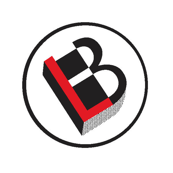
🧠 More Than a MonogramOver time, my three-color logo became more than a personal mark. It reflects how I think as a designer:Detail-oriented but not overcomplicatedCreative, yet structured and purposefulCapable of bridging concept and execution through AutoCAD, Adobe Illustrator, and hands-on quality assuranceIt represents my brand philosophy: design with purpose, precision, and adaptability.🧭 Ready for What’s NextI’m actively seeking remote creative opportunities as a:Packaging DesignerGraphic DesignerQuality Assurance SpecialistI bring a unique blend of creative vision and production precision, with hands-on experience across all three areas:Building structural products in AutoCAD and finalizing print layout in IllustratorPrepping proofs for sign-off productionOverseeing print plates and print cards for plant workflowsIf you need someone who can think structurally, work precisely, and add creative value every step of the way—I’m ready to jump in.👉 I’ve created more portfolio articles in this series—follow along to see the full journey.
🧑💻 Board Game Project During Hurricane Ike
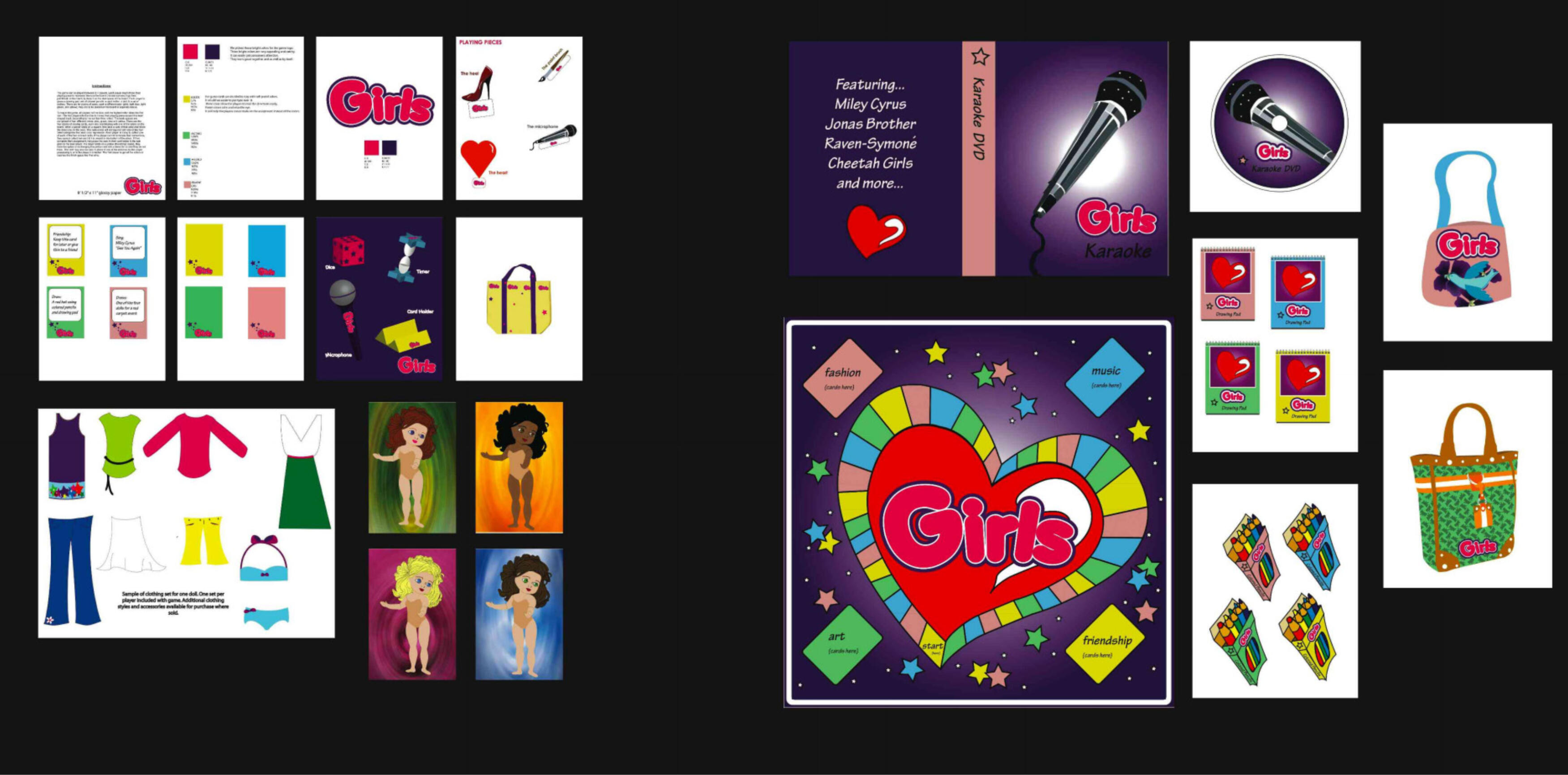
The left side showcases my team's work, while the right highlights my work.
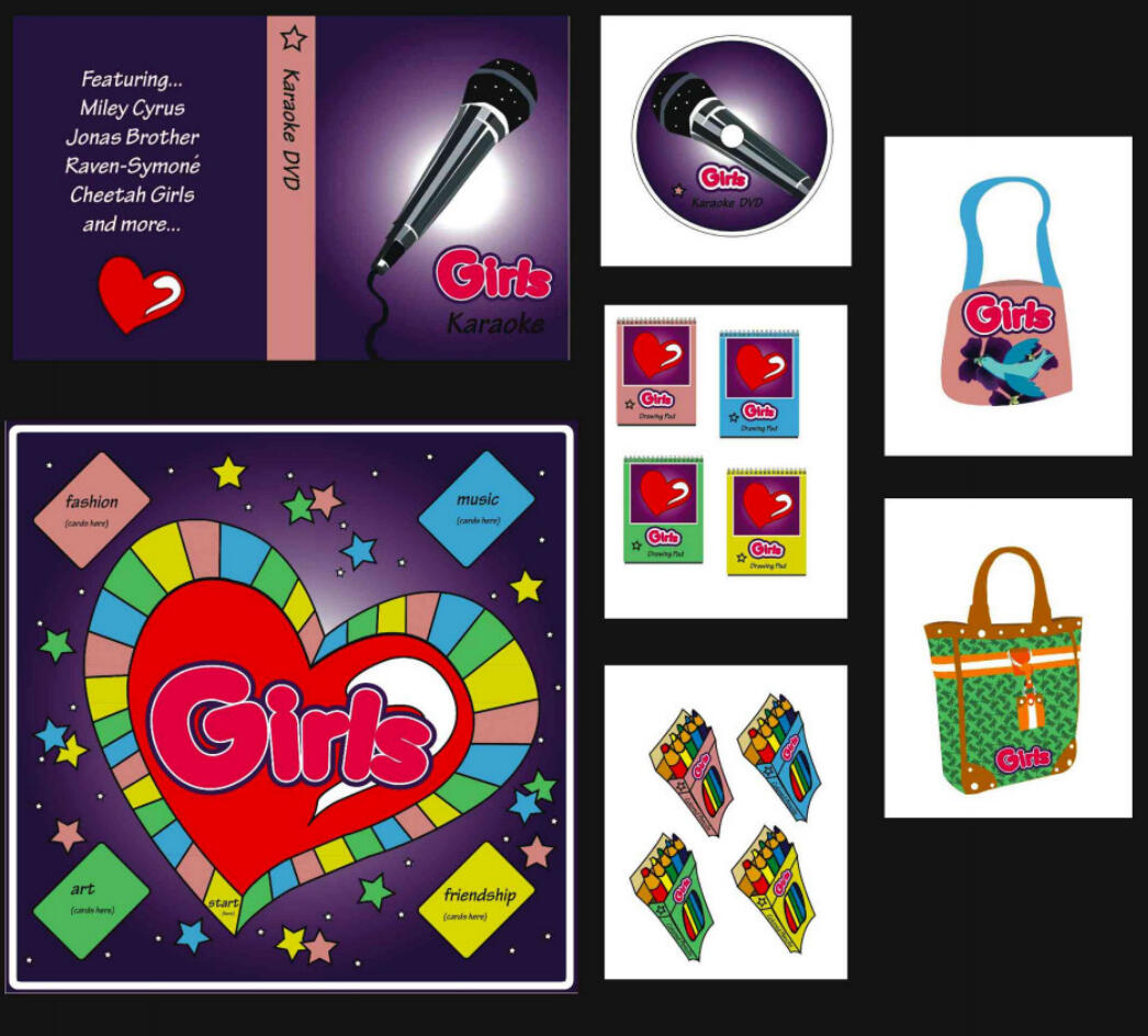
I experienced my first authentic taste of remote teamwork under circumstances no one could have planned for. In the fall of 2008, the remnants of Hurricane Ike tore through Ohio with Category 1 winds, knocking down power lines, shutting down neighborhoods, and leaving many of us without electricity for days.Despite the chaos outside, my team had a deadline to meet. Our assignment was simple on paper, yet wide open creatively:"Create something fun for teen girls."🎨 Brainstorming and Building the BrandWe started with a brainstorming session. One teammate suggested a board game—colorful, upbeat, and interactive. From that moment, the project took on a life of its own.Once the logo was developed, roles became clear:I designed the board layout, ensuring paths, icons, and spaces were engaging and easy to follow.I created a DVD cover to match the brand identity.I designed notepads, a colored pencil set, and two bag concepts to package and carry the game.What looks simple in a portfolio was actually a highly coordinated effort across multiple deliverables. Each component required consistent color, typography, and tone—the same precision needed in packaging design, brand identity, and print production.⚙️ Lessons Learned from the StormWorking through a storm turned out to be the best possible training for remote collaboration. Power wasn’t reliable, communication was fragmented, and we couldn’t meet in person—but we adapted, checked in when possible, and trusted each other. Somehow, we not only finished—we finished strong.Key takeaways I still use today:
1️⃣ Strong ideas come from open brainstorming. One comment—“What if we make a game?”—grew into a complete multi-piece product line.
2️⃣ Consistent color palettes build brand unity. Visual consistency makes any product feel intentional and trustworthy.
3️⃣ Communication is the backbone of remote work. Quick updates, shared files, and trust kept the project moving.
4️⃣ Deadlines don’t care about the weather. Staying calm and working with what you have is essential.
5️⃣ Adaptability is a design skill. Adjusting plans, artwork, or schedules is part of professional design work.🔍 ReflectionThis wasn’t my biggest or most technical project—but it was one of the most meaningful. It proved that creativity and discipline can thrive even under the most challenging conditions. In remote design, where files, feedback, and workflows constantly move across screens, this experience taught me that great work is possible anywhere—with commitment and communication.🧭 Ready for What’s NextI’m now actively seeking remote creative opportunities as a:Packaging DesignerGraphic DesignerQuality Assurance Specialist👉 Follow along—I’ve created more portfolio articles in this series.
👟 Nike Ad Design: Creativity, Basketball & Branding Energy
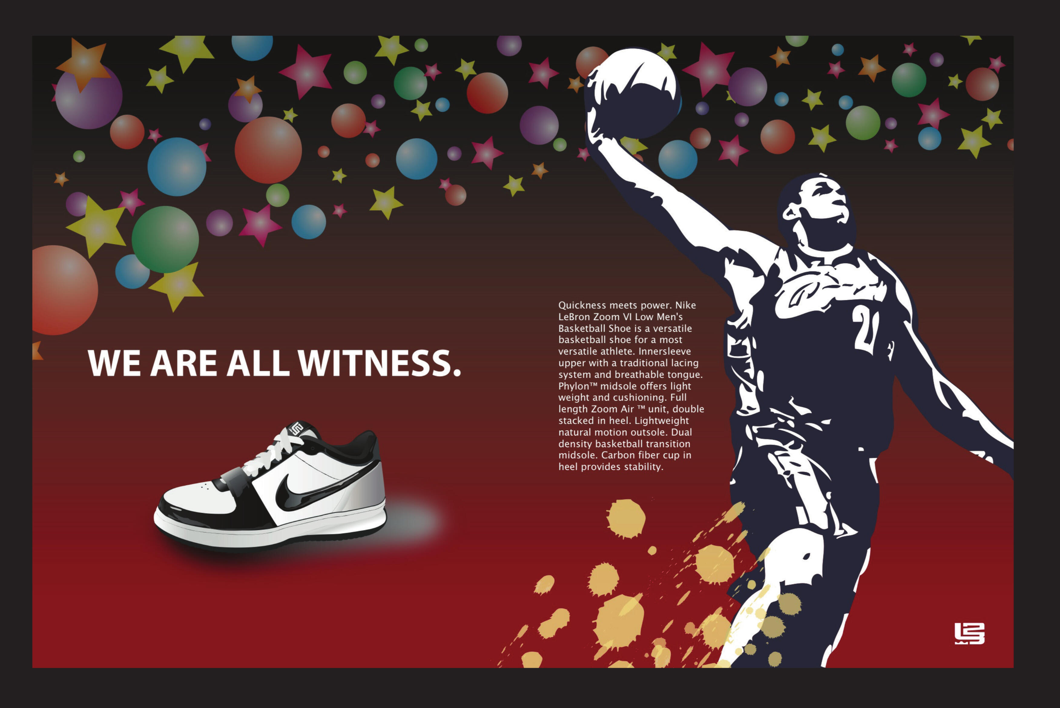
Packaging design may be my specialty, but I’ve always believed that stepping into new creative challenges sharpens a designer’s instincts. One of my favorite non-packaging projects was a custom, two-page Nike ad spread—a chance to merge two passions: basketball and design.This project allowed me to explore editorial layout, visual storytelling, and the energy that makes Nike campaigns feel larger than life.📖 From Concept to LayoutEven though magazines aren’t as common today, a powerful print ad still carries weight—especially when it blends culture, brand identity, and emotion. I wanted this design to feel like it belonged in Sports Illustrated, Space Jam promotional art, or one of Nike’s iconic illustrated campaigns.The centerpiece: LeBron James—whose dominance, discipline, and longevity reflect Nike’s values. The ad leaned into anticipation, legacy, and movement.The final layout included:Original visuals created for the spreadBold headline + supporting body copyStrong visual flow across both pagesBalanced imagery and negative spaceCentral illustrated shoe connecting brand and athleteI built the spread entirely from scratch using Adobe InDesign and Adobe Illustrator, refining typography, kerning, color balance, and page rhythm. The result: intentional, bold, and designed to feel like a real Nike release.✍️ Challenge: Copy + DesignUnlike packaging, where copy is usually provided, this project required me to write the messaging myself. The tone needed to match Nike—motivational, sharp, iconic—without imitation.The illustrated shoe became the anchor, tying together:Nike’s visual identityLeBron’s legacyThe emotional arc of the headlineCreating copy and design together gave the spread a cohesive rhythm. Nothing felt forced. Nothing felt out of place. Every element worked together to tell a story.🐐 Personal Touch: MJ vs. LeBronNo basketball-inspired project is complete without addressing the debate. Many call LeBron the GOAT 👑—but for me, Michael Jordan still holds that title 🐐👟.This isn’t about starting an argument—it’s about tapping into the culture that keeps basketball exciting. Great ads do more than show products—they spark reactions, start conversations, and make people feel something.🎯 ReflectionEven if this Nike ad never appears on newsstands, it represents versatility, imagination, and the ability to adapt design principles across mediums. Designing—whether packaging, editorial, or digital—is about:Solving problemsCommunicating emotionElevating the brandCreating visuals that linger in memoryAfter 7+ years in design and production, I’ve learned that a portfolio isn’t just a collection of files—it’s a storybook. Every project adds a chapter. Every challenge shapes the next opportunity.This Nike spread remains a favorite—not because it was assigned, but because it proves creativity grows when you push beyond your specialty.🧭 Ready for What’s NextI’m actively seeking remote creative opportunities as a:Packaging DesignerGraphic DesignerQuality Assurance Specialist👉 Follow along—I’ve created more portfolio articles in this series.
🎲 Gambling Awareness Ad: Purpose-Driven Design
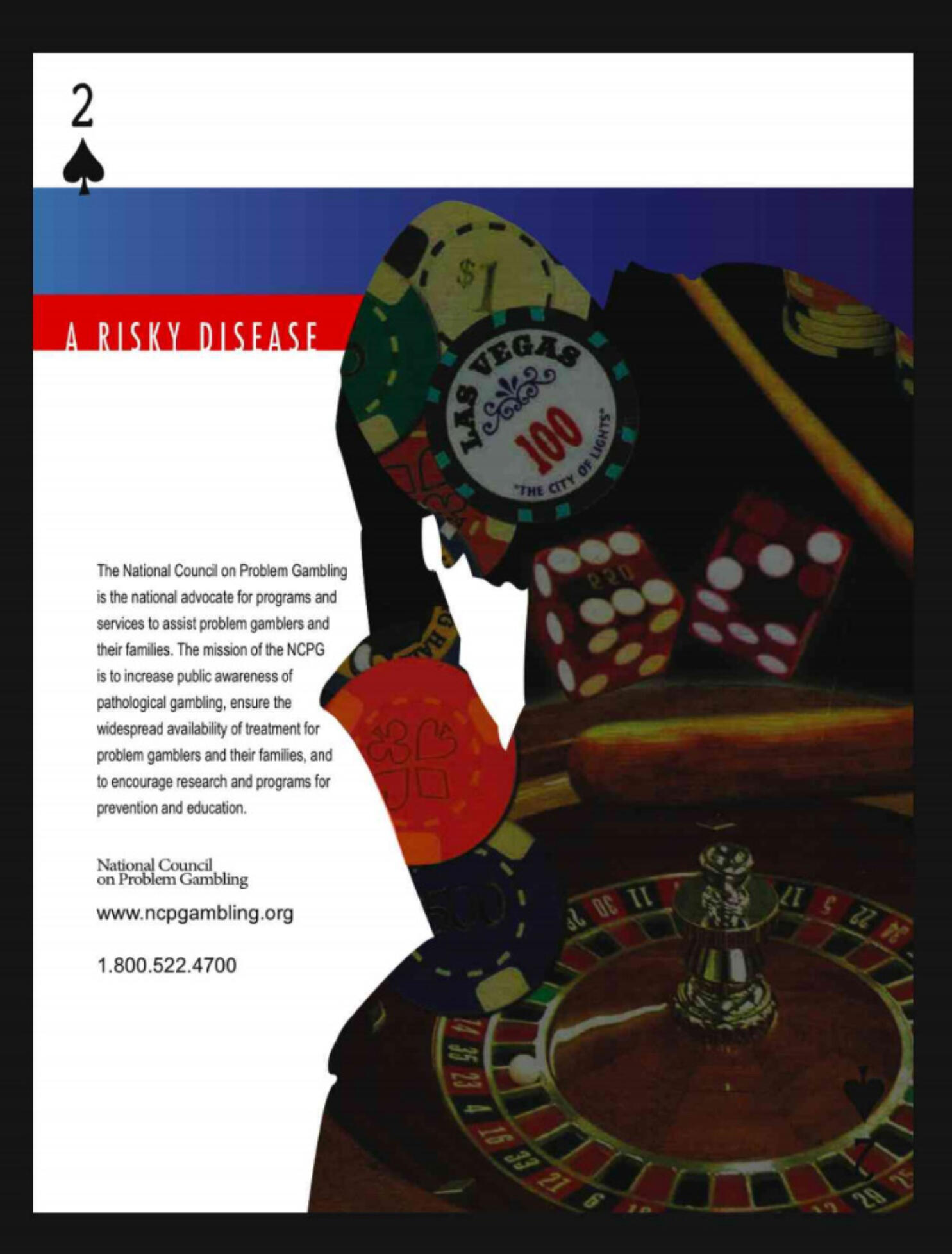
While much of my graphic design career has focused on packaging, some of the projects that shaped me the most had nothing to do with boxes, die lines, or product displays. Occasionally, a project arises that challenges me creatively and socially—requiring sensitivity, storytelling, and emotional awareness alongside design skills.One of the most meaningful of these was an awareness campaign highlighting the hidden consequences of gambling.Project Background: A Personal ConnectionI was born in Las Vegas, surrounded from day one by billboards, jackpots, neon lights, and slot machine chimes. I moved away before turning three, but the city’s influence stayed with me. Over the years, I’ve seen how gambling can shift from entertainment to financial and emotional strain—impacting families, relationships, savings, and stability.When I had the chance to design a gambling-awareness concept, I knew I wanted it to be honest, empathetic, and acknowledge the complexity of the issue without judgment. This wasn’t just a design assignment—it was an opportunity to translate real-life observations into a visual message that might prompt someone to pause, reflect, and reconsider before consequences piled up.Design Objectives1️⃣ Communicate Risks Clearly
Convey financial strain, emotional burnout, and hidden costs—without feeling preachy or sensationalized.2️⃣ Design with Empathy
The tone needed to say, “You’re not alone,” rather than, “You’re doing something wrong.”3️⃣ Demonstrate Versatility
Push design skills beyond packaging: typography, composition, messaging, and visual pacing had to work together to feel both bold and thoughtful.Process & ExecutionConcept Development
The idea relied on contrast: the visual language of casinos—bright colors, energetic patterns, and excitement—set against muted tones reflecting risk and consequence. This shift guided the viewer from fun escape to unexpected cost.Copywriting
Text was short, direct, and emotionally charged. The goal wasn’t to overwhelm with statistics, but to spark recognition: “This could be me.”Visual Creation
Using Illustrator and Photoshop, I designed custom illustrations and layouts balancing clarity with impact. Visual hierarchy guided the audience from casino aesthetics to a deeper, reflective message.Iteration & Refinement
Multiple revisions fine-tuned:Tone of the messageAlignment and spacingColor balanceEmotional impactTypographic hierarchyEach adjustment brought the design closer to the vision: professional, honest, and respectful.Outcome & ReflectionThe final design achieved what I hoped: a clear, empathetic reminder that gambling has hidden costs—costs often unnoticed until they accumulate.More importantly, this project reminded me why I love design:It’s not just visuals—it’s solving problems with empathy.It’s storytelling, not decoration.It’s creating work that’s visually strong and emotionally intelligent.It also reaffirmed my ability to move fluidly between design challenges, from packaging to social awareness campaigns. This project broadened my perspective and strengthened my skill in designing not just for people, but with their experiences in mind.🧭 Ready for What’s NextI’m now actively seeking remote creative opportunities as a:Packaging DesignerGraphic DesignerQuality Assurance Specialist👉 Follow along—I’ve created more portfolio articles in this series.
📰 Turning Tech Into Story: My iTech Brochure Design
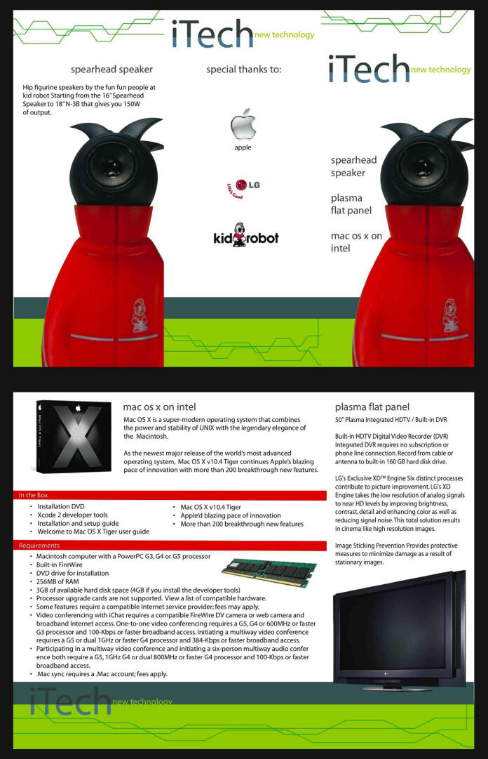
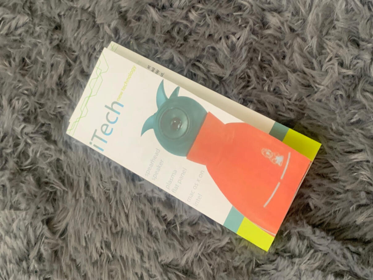
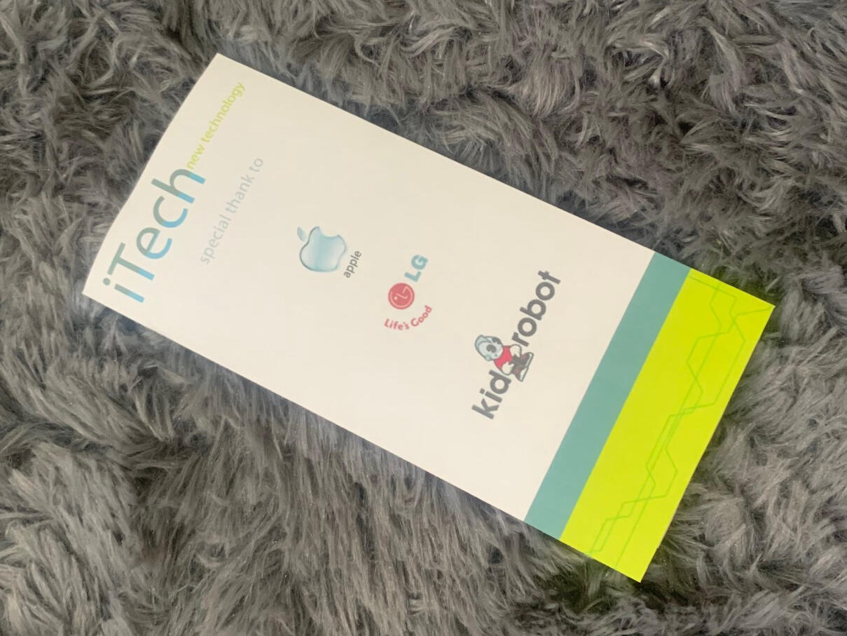
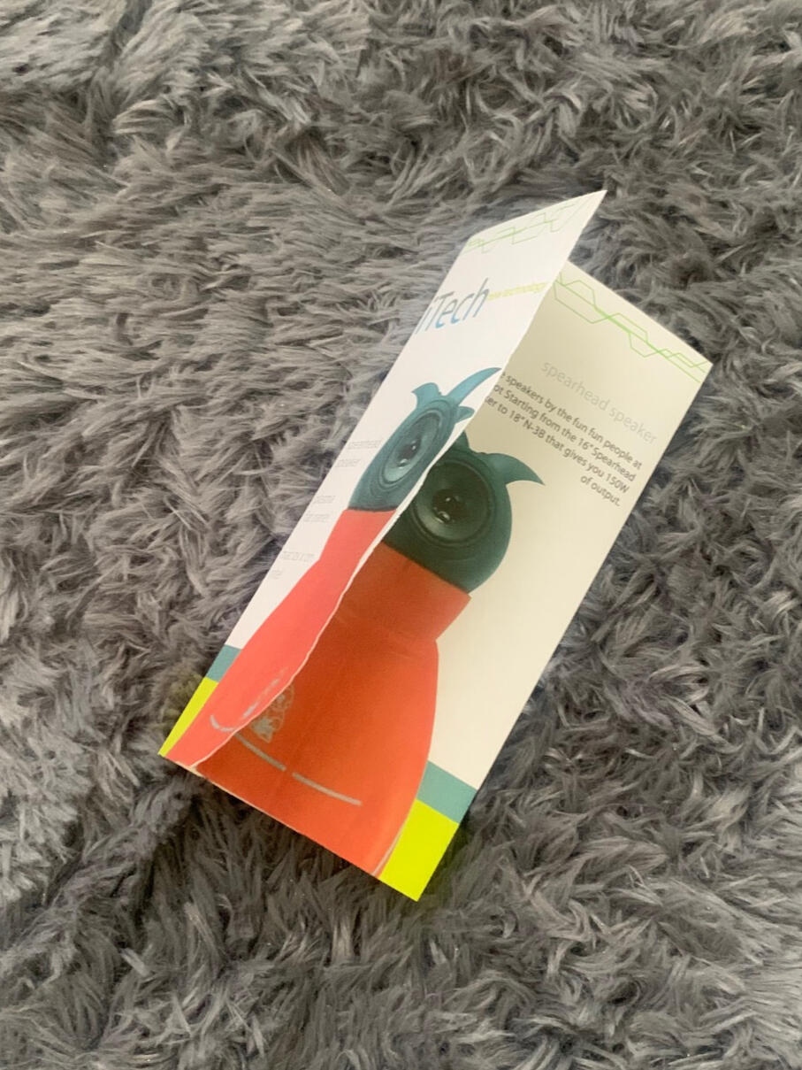
Design isn’t just about visuals—it’s about storytelling through structure, layout, and user experience. For my iTech brochure project, the goal was more than a clean design; I wanted to merge modern technology with compelling visual storytelling, producing a brochure that felt both professional and approachable.Concept: Making Tech TangibleI envisioned a brochure that could stand out on a trade show table or in an electronics store—polished, clear, and engaging. To achieve this, I balanced technical specifications with a human-centered approach, ensuring readers could absorb information effortlessly while feeling inspired by the brand.Featured products included:Spearhead Speakers – bold, playful, and visually strikingMac OS X on Intel – software features presented clearly for readabilityPlasma Flat Panel TVs – complex specs communicated visuallyBrand Collaborations – subtle nods to Apple, LG, and Kidrobot, reinforcing credibility and contextBy blending product highlights with creative callouts, the brochure told a cohesive story: iTech wasn’t just about gadgets—it was about lifestyle, usability, and innovation.Design Approach: Structure Meets StorytellingTo make the brochure work, I focused on three principles:Balance: Every spread was structured yet flexible. White space was as intentional as typography, creating breathing room for content.Storytelling: Pages weren’t overloaded with specs. Icons, color hierarchy, and layout guided readers naturally through the information.Brand Presentation: Even as a fictional company, iTech needed to feel credible. Every layout choice reinforced brand identity, polish, and consistency.The result was a brochure that felt modern, versatile, and visually engaging—a piece I could confidently envision in a real-world campaign.Lessons LearnedThis project reinforced one of my core design philosophies: clarity and accessibility are just as important as aesthetics. Whether designing print collateral, packaging, or digital materials, effective communication is the foundation of great design. By combining graphic design principles, brand storytelling, and print production considerations, I created a brochure that looked appealing and connected effectively with the audience.🧭 Ready for What’s NextI’m actively seeking remote creative opportunities as a:Packaging DesignerGraphic DesignerQuality Assurance Specialist👉 Follow along—I’ve created more portfolio articles in this series.
🧦 Designing Simplicity: The Story Behind Ardmore Cleaners logo
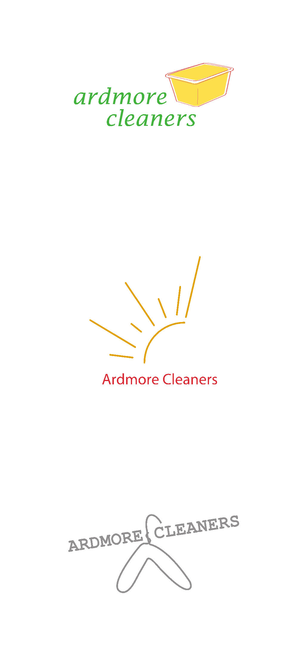
Great design often begins with observation. For the fictional brand Ardmore Cleaners, inspiration came from everyday objects: a laundry basket, a hanger, and the sun. These simple elements became the foundation of a logo system rooted in clarity, minimalism, and purpose.Concept: Minimalism with MeaningThe goal wasn’t just a visually clean logo—it needed to feel clean and approachable. I designed a system with three variations:3-color option – full vibrancy and detail2-color option – balanced and versatile1-color option – minimal, adaptable for any applicationThree key visuals defined the brand identity:🧺 Laundry Basket – representing service and reliability👔 Hanger – conveying care, organization, and presentation☀️ Sun – symbolizing freshness and warmthThese symbols formed the visual language for Ardmore Cleaners, creating a flexible, cohesive logo system adaptable across all business materials—signage, digital media, and print.Design Approach: Purpose Over ComplexityI intentionally limited the color palette to green, yellow, red, and grayscale to ensure clarity and versatility. Every line and shape was purposeful—no extraneous detail. The challenge wasn’t just visual; it was translating brand values into instantly recognizable, meaningful symbols.This project reinforced that effective branding often comes from simplicity. Clean lines, thoughtful structure, and meaningful symbolism communicate more than complex graphics ever could.Reflections and TakeawaysAs a designer, I thrive at the intersection of research, creativity, and storytelling. Ardmore Cleaners reinforced my approach to branding: every decision must be intentional, every element functional, and every design scalable across media.Whether designing logos, packaging, or visual systems, I focus on work that is minimal, meaningful, and human-centered. Projects like this allow me to combine graphic design, identity development, and creative problem-solving in ways that resonate with both the brand and its audience.🧭 Ready for What’s NextI’m now actively seeking remote creative opportunities as a:Packaging DesignerGraphic DesignerQuality Assurance Specialist👉 Follow along—I’ve created more portfolio articles in this series.
🎉 Don’t Miss a Beat – Poster Design Project
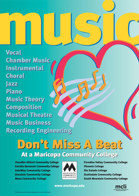
My updated music poster design
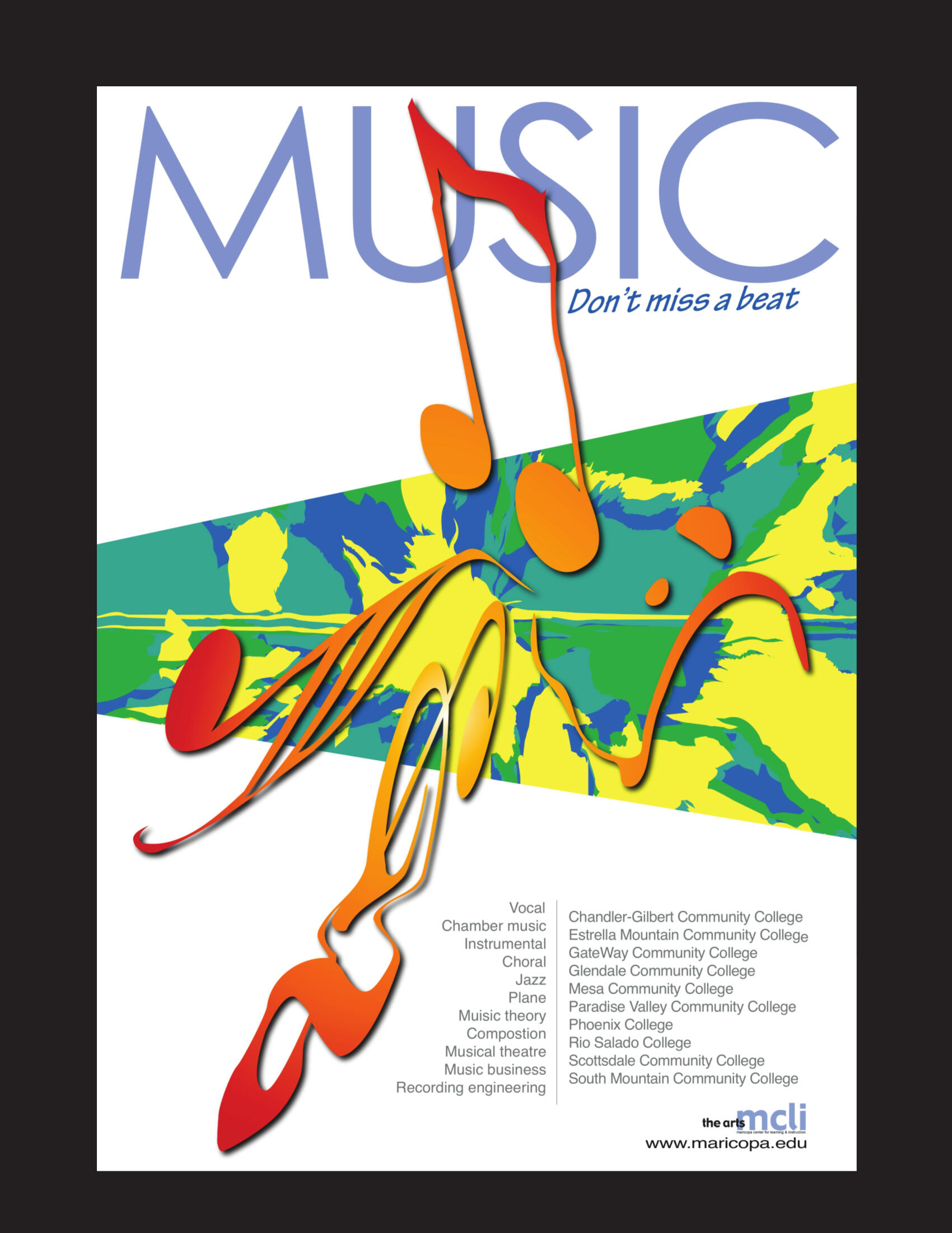
The original poster design
Music has a rhythm that moves us—and I wanted that same rhythm to move through this design. For this project, I created a promotional poster for Maricopa Community Colleges’ music programs, aiming to convey energy, diversity, and sound. My goal wasn’t just to show music visually—it was to translate motion, emotion, and flow into graphic form, allowing viewers to “hear” the rhythm through color, shape, and composition.Concept: Inspiration in MotionI drew inspiration from the surreal energy of Salvador Dalí—particularly the fluidity of his melting clocks—and contemporary designer Siena Harris, who reminded me that design can bend perception, evoke emotion, and blur the line between art and experience.The result is a dynamic composition where musical notes and abstract textures dance across the page, celebrating all 10 colleges under one unified brand. From vocal performance to recording engineering, the poster visually connects each program through a shared heartbeat of creativity.💡 Design FocusThree principles guided the layout:Movement: Strong typographic hierarchy directs the viewer’s eye like a melody.Emotion: A bright, electric color palette captures the vibrancy and energy of music.Unity: Stylized musical notes integrated with abstract art harmonize diverse programs under one cohesive identity.Every element—from the flow of type to the pulse of color—was placed intentionally, echoing the layered, emotional, and alive nature of music.🎨 Behind the DesignThe challenge wasn’t just arranging graphics; it was orchestrating them. Like composing a song, each layer had to balance structure and creativity. Typography, color, and visual rhythm worked in harmony to create a poster that was both visually striking and brand-aligned.The final piece reflects the essence of music education: a balance of order and freedom. It highlights the range of opportunities across the colleges while inviting students to explore their own creative rhythm.🧭 Ready for What’s NextI’m actively seeking remote creative opportunities as a:Packaging DesignerGraphic DesignerQuality Assurance Specialist👉 Follow along—I’ve created more portfolio articles in this series.
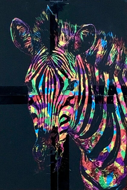
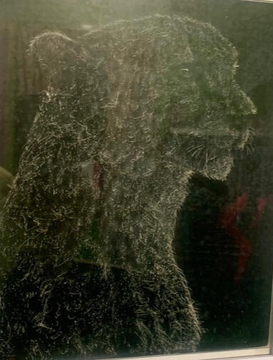
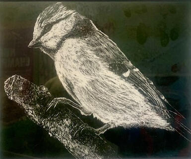
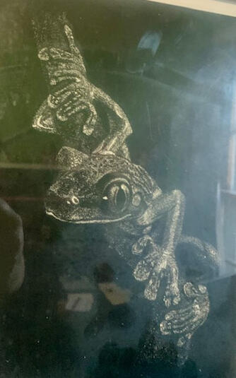
🦒 Designing Nature’s Grace in Digital Form
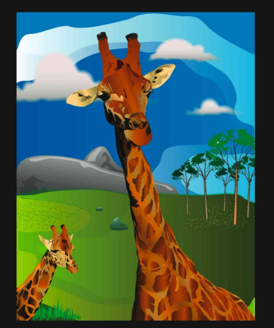
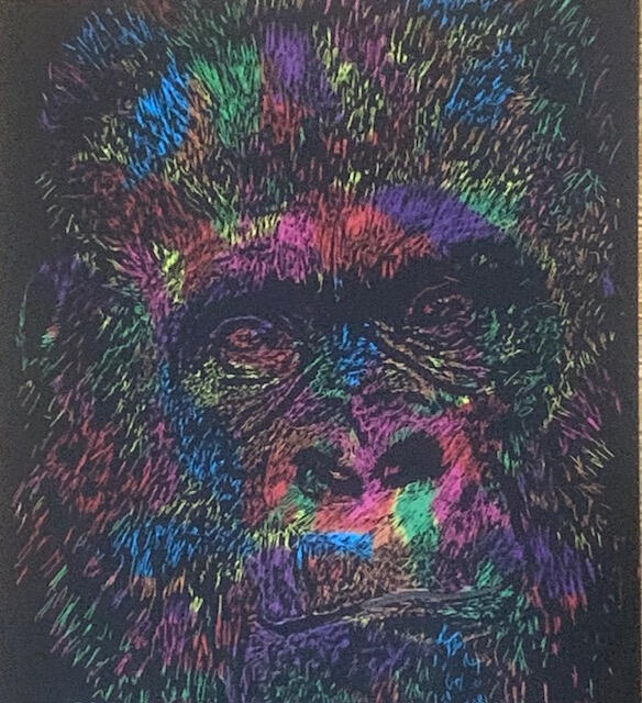
I’ve always loved making animal art — capturing movement, character, and expression through line and contrast. One of my favorite traditional media is scratchboard art, where I’ve created pieces featuring a gorilla, zebra, cheetah, bird, frog, and dog. As seen below.
For this project, I aimed to harness a passion for wildlife and bring it into the digital realm, combining artistic expression with technical precision.🌿 Project: Vector Wildlife IllustrationThis piece is a vector design—clean, flexible, and fully scalable—ideal for branding, logos, or illustrations. Vector art allows me to balance precision and creativity, ensuring every line, shape, and detail remains crisp at any size.The subject: a pair of majestic giraffes set against a stylish savannah backdrop. The illustration strikes a balance between realism and artistic flair, conveying the gentle elegance of these creatures in a visually engaging composition.🌅 Creative ApproachWhat began as a simple idea evolved into an exploration of wildlife storytelling through design. My goal wasn’t just to replicate animals, but to evoke emotion, depth, and serenity. Using bold vector shapes, layered gradients, and careful placement of elements, I created:Layered clouds and rolling hills to guide the viewer’s eyeGradient lighting to evoke a warm, late-afternoon atmosphereA sense of stillness and wonder, inviting viewers into the scene🧩 Skills AppliedVector Illustration: scalable paths for sharpness and flexibilityColor Theory & Lighting: gradient tones that establish mood and depthComposition & Layering: guiding the viewer’s eye with structure and flowWildlife Anatomy: accurate forms and proportions for natural realism💡 ReflectionsThis project reinforced why I love illustration: it’s more than visuals—it’s storytelling through design. Every line, shape, and gradient can evoke emotion, connect viewers with nature, and highlight the beauty and balance of the natural world.🌍 Open to Creative CollaborationsI welcome opportunities to bring visual storytelling to life, including:IllustrationBrandingDigital and print visual storytelling🧭 Ready for What’s NextI’m actively seeking remote creative opportunities as a:Packaging DesignerGraphic DesignerQuality Assurance Specialist👉 Follow along—I’ve created more portfolio articles in this series.
📐 How Ideas Connect: The Puzzle of Innovation
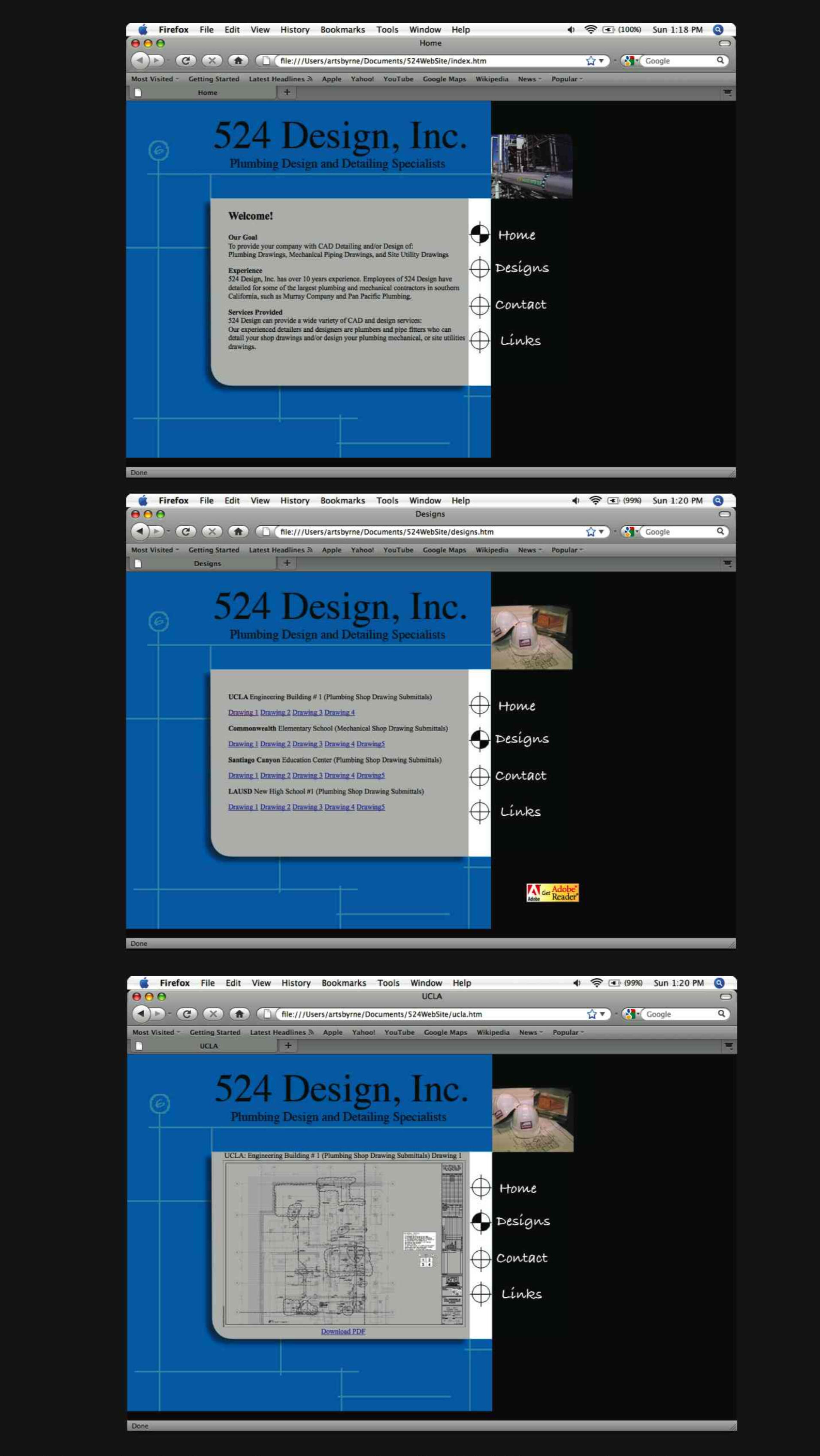
Web design often seems simple from the outside—a mix of visuals, layout, and content. The reality is far more complex. It’s about precision, patience, and understanding how a single line of code can make a significant difference. One minor adjustment could take hours, but every careful tweak mattered.🖥️ Project OverviewFor this project, I used Dreamweaver for structure, Illustrator for visuals, and Photoshop for refinement. Each tool played a distinct role, and bringing them together felt like assembling a complex puzzle. Designing a website wasn’t just about dragging and dropping images—it was about organizing assets, refining copy, and ensuring the finished site functioned seamlessly.The assignment: redesign an existing website to create a theme connecting to the company’s origins and identity. I chose 524 Design, Inc., an engineering solutions company. Their old website was chaotic—overlapping menus, inconsistent layouts, and confusing navigation. It needed clarity, structure, and purpose.✨ ApproachI focused on simplicity and cohesion:Blueprint-inspired theme reflecting technical precisionCAD-style elements integrated into the layout for structureConsistent hierarchy and spacing to guide the user’s eye and improve usabilityThe final design felt steady, professional, and aligned with the company’s engineering identity. Even so, I acknowledged that design is personal—each creator interprets vision differently. That tension made the process meaningful.💡 ReflectionsThis project reinforced that great design often looks effortless but is built on careful, deliberate work. Behind every clean interface lie hours of trial, error, and problem-solving.It also highlighted the transience of digital spaces. Websites evolve, trends change, and code becomes obsolete. At the time, I felt like an imposter with coding—but my creativity adapted, bridging the gap between design and functionality.Ultimately, design isn’t about permanence—it’s about purpose, clarity, and connection. The websites we create may not last forever, but the skills, insights, and problem-solving we develop carry forward to the next challenge.🧭 Ready for What’s NextI’m actively seeking remote creative opportunities as a:Packaging DesignerGraphic DesignerQuality Assurance Specialist👉 Follow along—I’ve created more portfolio articles in this series.
🍲 Motion, meet storyboard, meet Flash UI
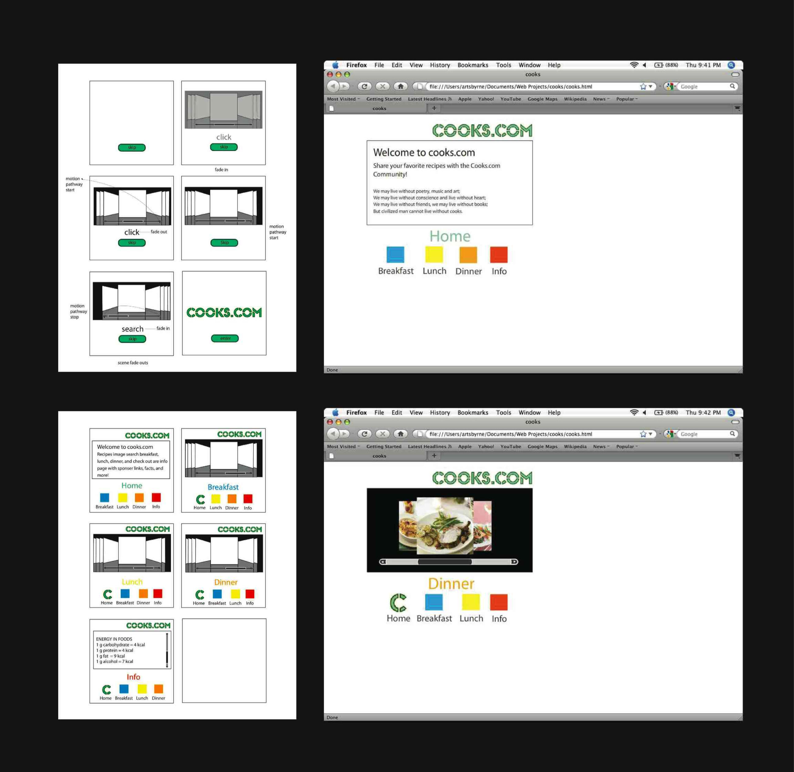
Web design comes in countless forms, and every designer approaches it differently. What remains constant, however, is motion and flow. These elements guide users through a page, help them absorb information, and shape their experience of a concept. When I develop a storyboard or early design concept, motion and flow form the backbone of my thinking—they create the rhythm that determines whether a design succeeds or falls short.Closing My Portfolio with Web DesignI chose to close my portfolio with two examples of web design. Admittedly, web design has never been my strongest skill set—but my hesitation has never been about learning code. I often pick it up faster than expected. The challenge lies in the foundational elements: content, client guidance, and assets. Missing text, imagery, or brand direction can slow progress more than any technical challenge.Even so, time and focus can solve nearly any design problem. In one project, I had roughly three days to complete a full site redesign. My objectives were clear: select a purposeful color palette, establish a theme, retrieve existing assets, and rebuild the site from scratch while considering user interactions, attention flow, and engagement.🎨 Thoughtful Design DecisionsColor: Every palette communicates before a word is read. Colors establish tone, evoke trust, and guide the site’s personality intentionally.Workflow & Structure: Reviewing old files revealed messy workflows, allowing me to reorganize, refine, and reconnect with ideas while thinking like a user. What would they look for first? What could be simplified? What needed emphasis?Typography & Layout: Every section required micro-scale decisions. Typography created hierarchy, layouts provided breathing room, and imagery enhanced the story. Hover effects, transitions, and button placement all contributed to a cohesive user experience.💻 Flash-Based Cooking InterfaceFor a second example, I developed a Flash-based cooking interface inspired by the iPod UI. Users could scroll through items like an album and view detailed instructions upon selection. This approach turned a basic cooking guide into a playful, intuitive experience. Motion and interaction created engagement, combining functionality with delight.💡 ReflectionsThese projects reinforced key lessons:Web design relies as much on organization and structure as it does on visuals.Motion and flow are core to user experience, guiding attention and enhancing interaction.Coding hesitation doesn’t hinder my ability to think systemically, solve problems, and deliver intentional design solutions.Ultimately, even when web design is challenging, the principles remain the same: clarity, consistency, and purpose. With direction, structure, and attention to detail, I can transform a website into an experience that is functional, thoughtful, and visually consistent.🧭 Ready for What’s NextI’m actively seeking remote creative opportunities as a:Packaging DesignerGraphic DesignerQuality Assurance Specialist